Collaborated with Pentagram on the design and development of a custom typeface for Macrofactor, a science-based health and fitness app.
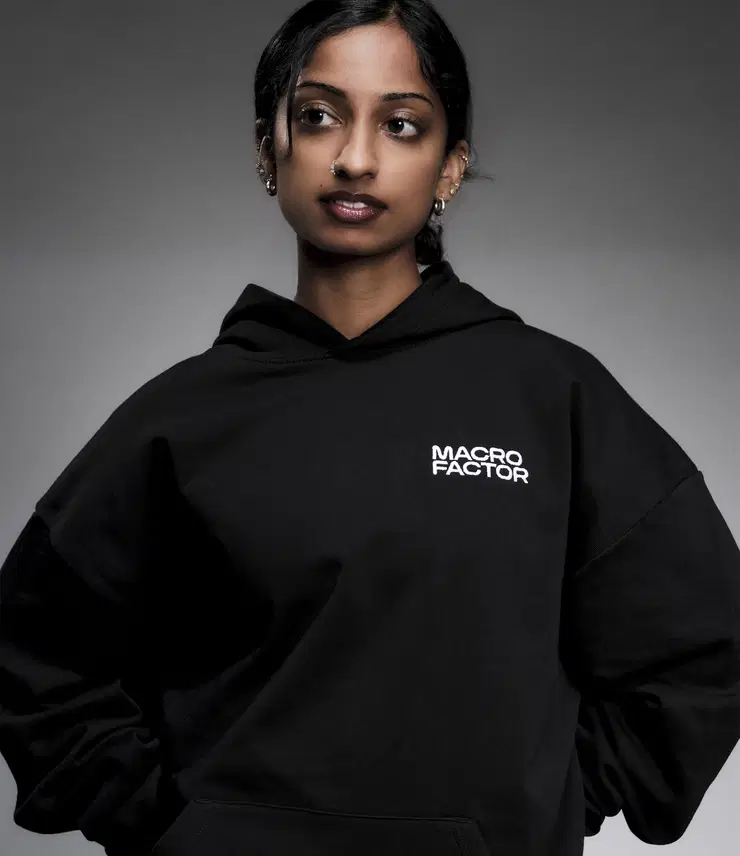
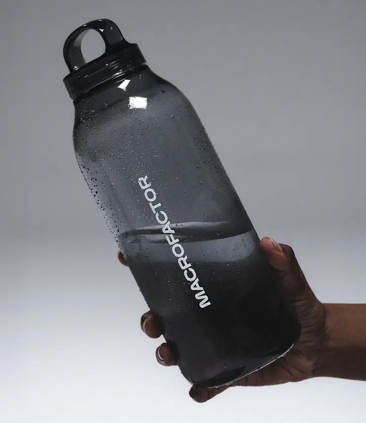
In the ecosystem of nutrition apps, most products trade on convenience or aspiration: they count calories, gamify habits, or stage lifestyle fantasies. These technologies often feel disposable to dedicated gym-goers and disciplined athletes—too lightweight to match their rigor. MacroFactor is built for people who want to get serious about their bodies—whether that means losing weight, gaining muscle, or simply building healthier habits. Developed by scientists, coaches, and engineers, the app turns adaptive algorithms into practical guidance, delivering precision that users can trust. Its proposition is simple and direct: knowledge creates clarity, and clarity creates progress. But clarity alone doesn’t make a brand. Numbers require narratives; data needs design”.
Project: Custom Font
Client: Pentagram, NY
Year: 2025
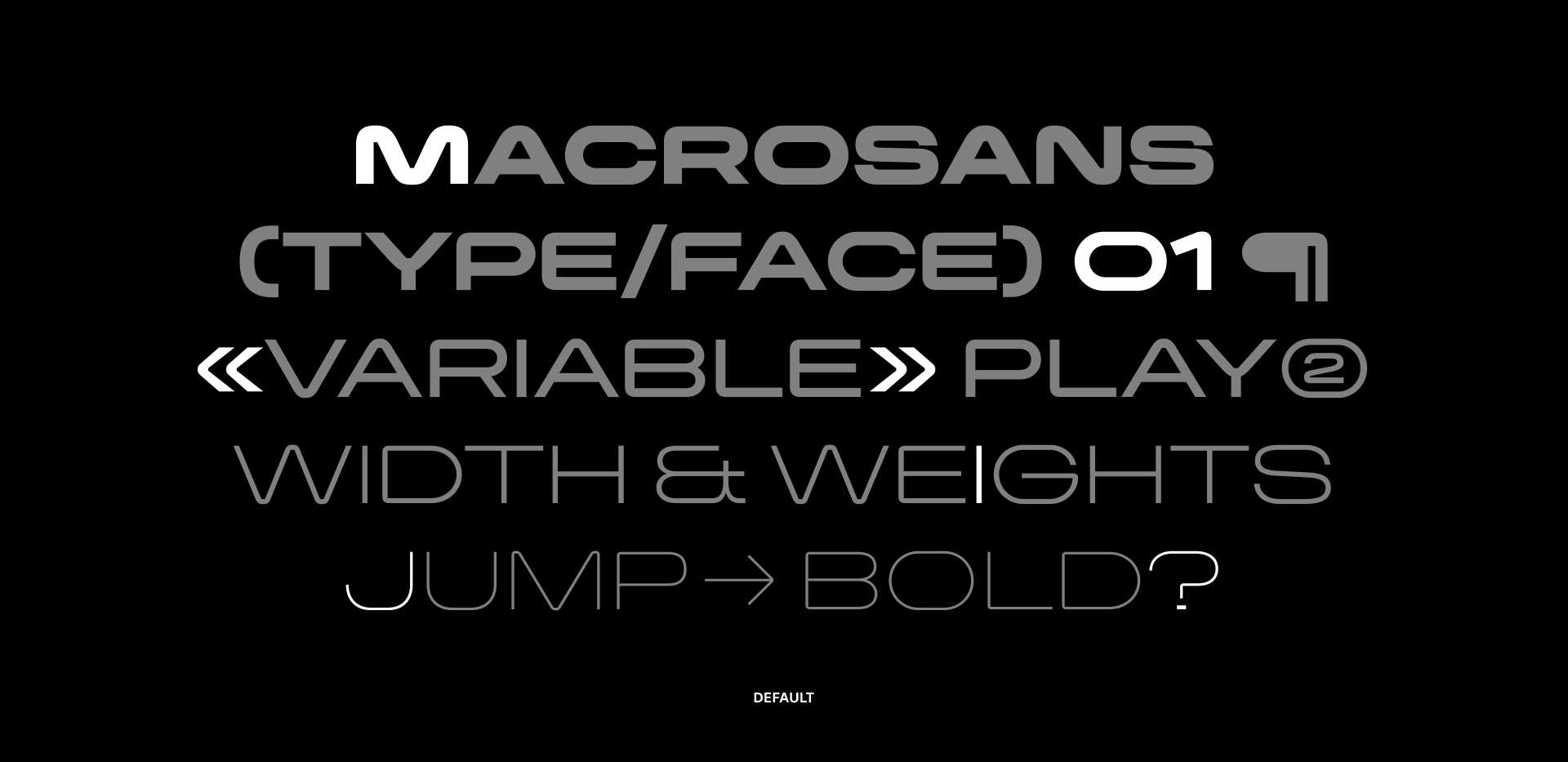
THE TYPEFACE
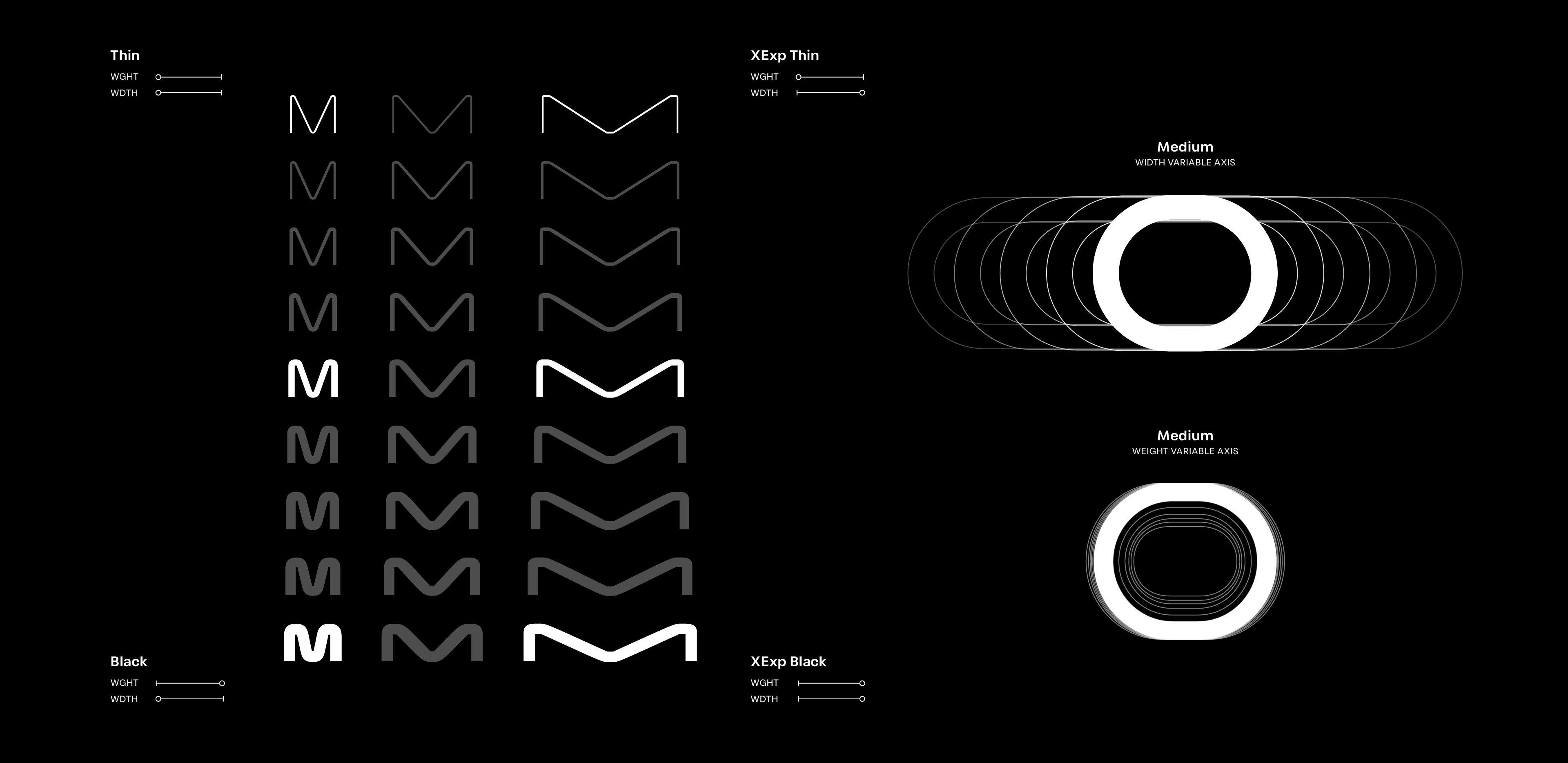
STYLES & CHALLENGES
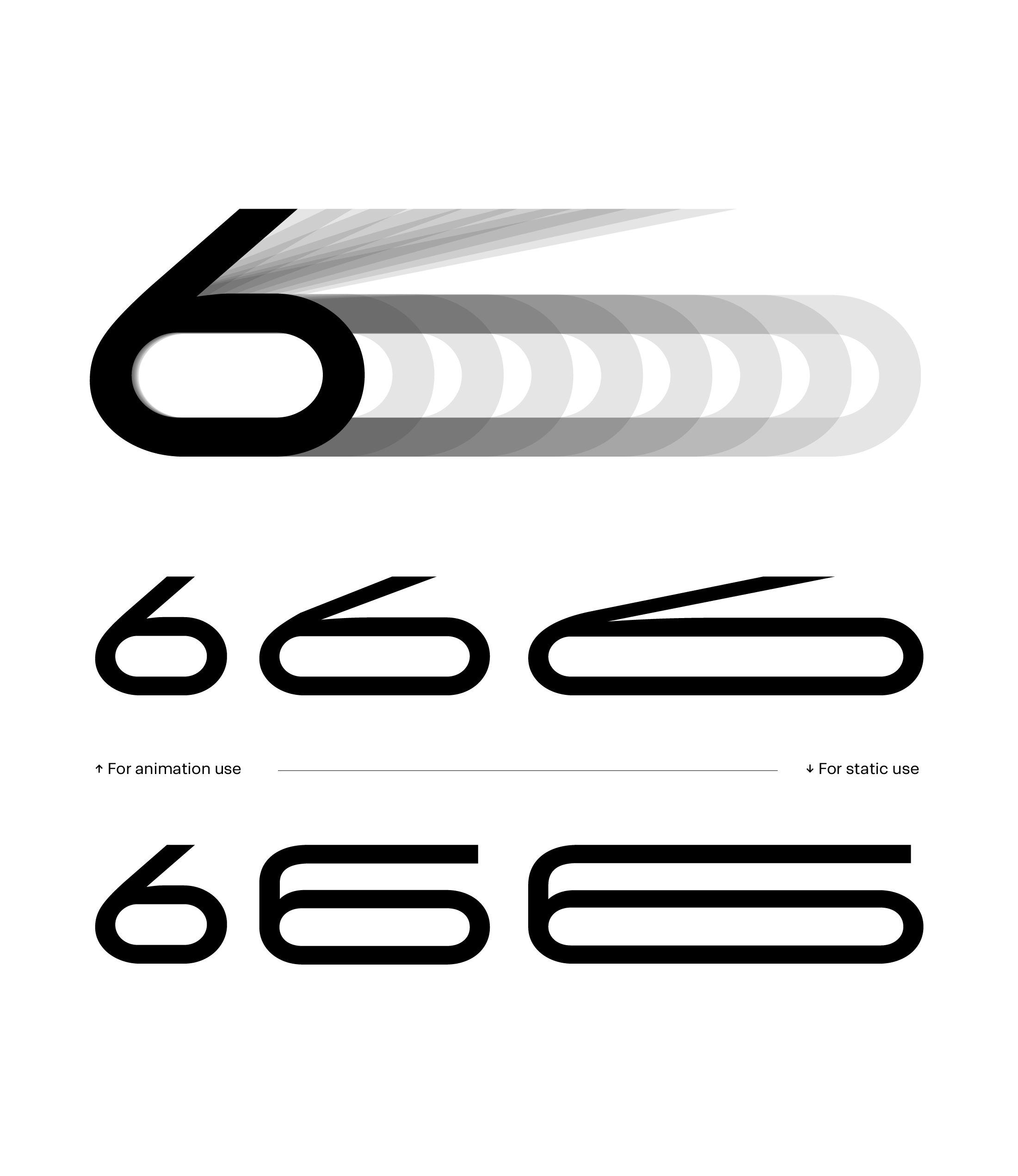
Across its different styles, a number of challenges make this project a distinctive case. Both drawing and interpolation were carefully designed to build a multi-style family that functions as a versatile graphic resource, capable of addressing a wide range of design scenarios while also enabling text animation, a key aspect that reinforces and amplifies the brand’s core concepts.
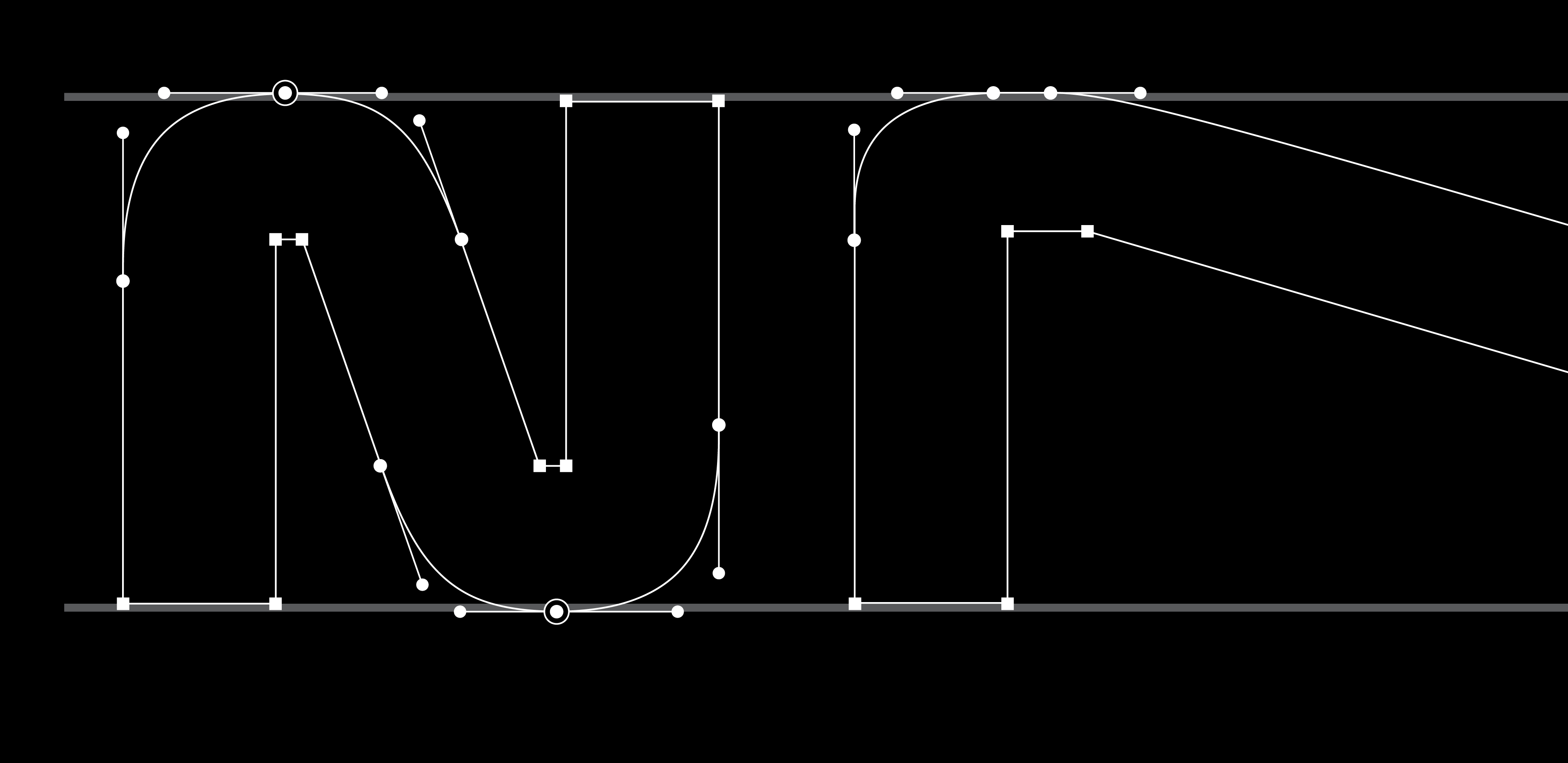
DRAWING
The typeface is built from six masters: Thin, Regular, Black, XExp Thin, XExp Regular, and XExp Black. These masters allowed us to control each stage of interpolation while defining, together with the client, the specific instances needed to meet the brand’s design requirements.
Weight progression was handled optically, while width expansion was approached mathematically. This combination resulted in a typeface that aligns with established weight-scale standards, while maintaining consistent width variations. Such consistency enables smooth animations and gives users precise control over animated transitions, without the type design itself disrupting the visual progression.