How does the sound become letterform? What letterform becomes Candombe? Conceptualization, design process and features of a variable font deeply rooted in Afro-Uruguayan rhythm.
Mazumbá is a typographic project that originated within the context of the Master's in Typography Program at the Faculty of Architecture, Design, and Urbanism of the University of Buenos Aires, Argentina, in 2019.
Its primary objective is to address design challenges in the composition of editorial pieces—specifically songbooks of Uruguayan popular music—where Latin script and musical notation coexist. Moreover, considering the close relationship between the subject of study and Uruguayan culture, Mazumbá aims, in morphological terms, to make visible and bring to light, through typography, a portion of our—initially Uruguayan, followed by Latin American—history, culture, and tradition.
Designed by: Matías Di Iorio
Version №: 1.0 (November 2023)
Latin Script & Musical Notation
Throughout time, music, like other forms of art, has been —and continues to be, in my opinion— testimony of societies and civilizations; documentation of ways of thinking, exposition of diverse perspectives and expressions, and certainly generator of identity and cultural wealth.
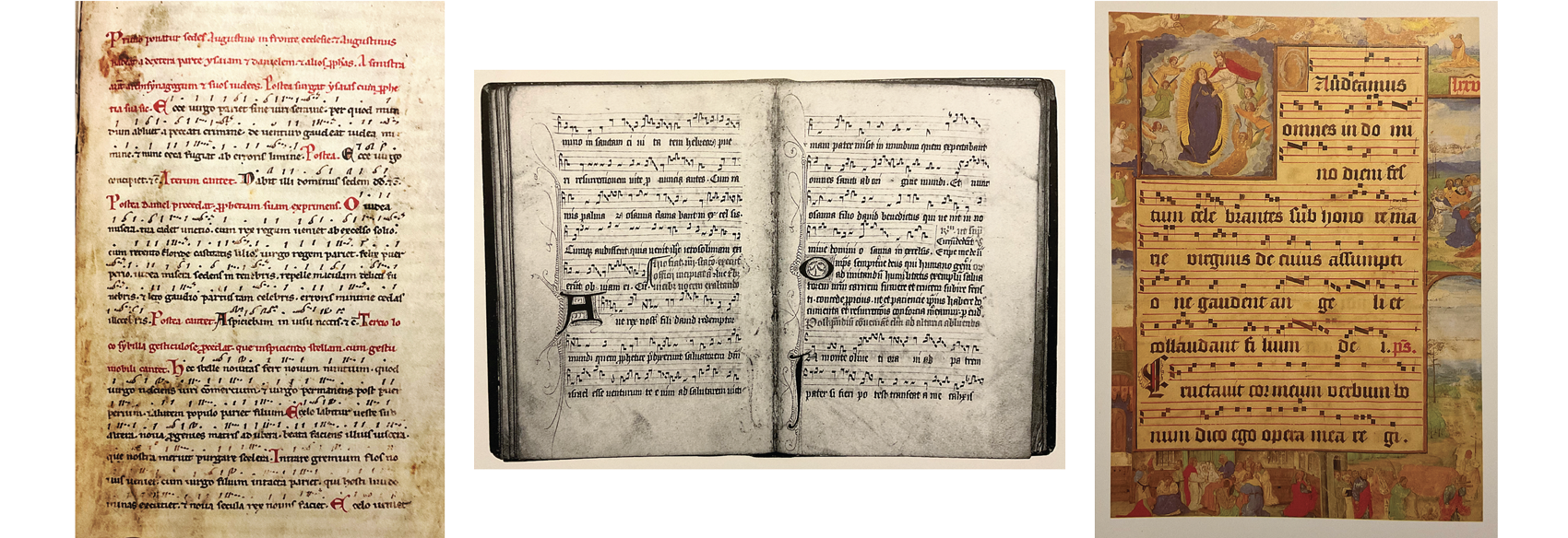
← NEUME NOTATION — s.XIII — Carmina Burana, The Ludus de nativitate domini, Germany
(Meeting with Remarkable Manuscripts, Christopher De Hamel)
↑ QUADRATA NOTATION — s.XV — Processional, Palm Sunday, England
(A History of Illuminated Manuscripts, Christopher De Hamel)
→ QUADRATA NOTATION — s.XV — Introit for the Mass, Assumption of the Virgin, Belgium
(A History of Illuminated Manuscripts, Christopher De Hamel)
Through Latin script, and the way musical notation has accompanied it, constantly evolving, we can somehow see how music has reflected the identities of specific eras and places, within socio-cultural and economic contexts, closely linked to available technologies.
With this in mind, Mazumbá unfolds as a morphological exploration associated with a specific musical style, brimming with personality and history.
Shape
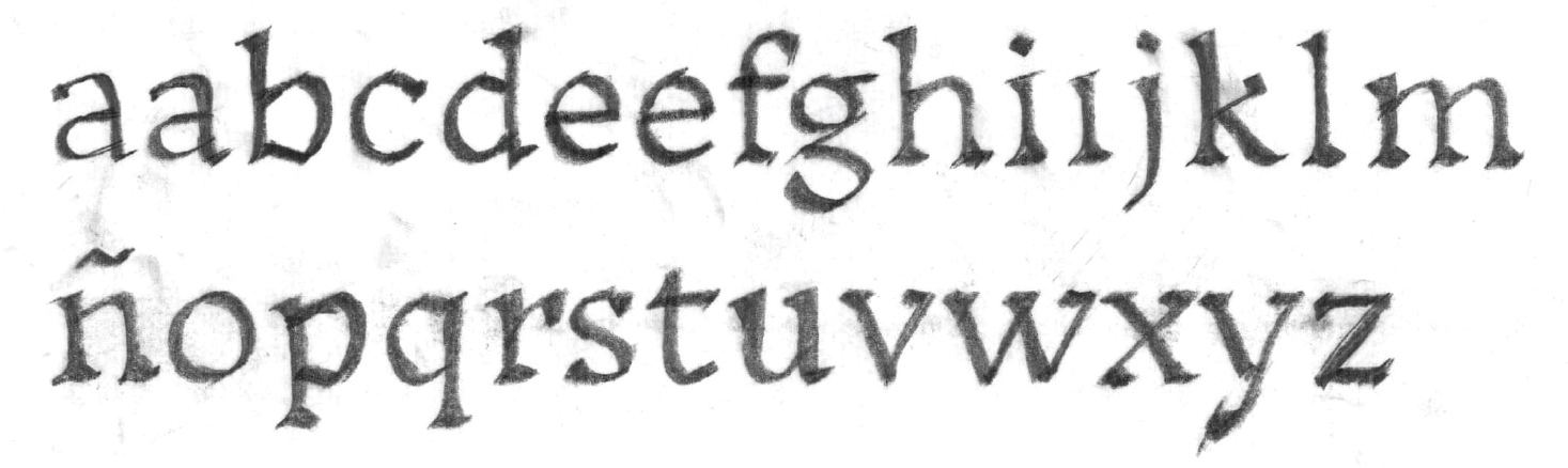
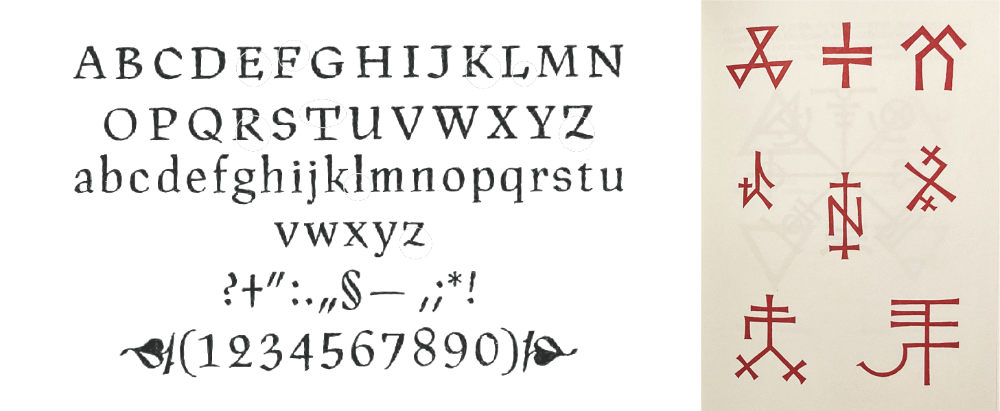
Mazumbá draws its shapes primarily from the sound of Candombe drums. Each of its styles explores the tension of the drumhead and sound to create a typeface that combines two distinct styles. On one hand, the serif spectrum, given by its versions: thin, light, and regular. On the other, the sans-serif spectrum: bold, extra bold, and black.
Its main weight styles (thin, regular, bold, and black) are directly linked to music and draw reference from various typographic styles.
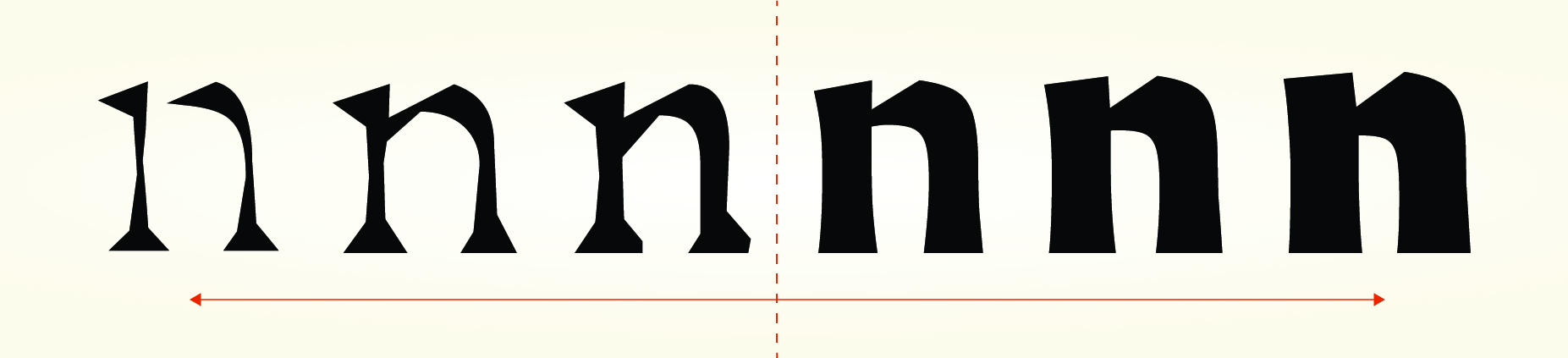
The thin style represents time, the heartbeat of Candombe. This "invisible" and foundational aspect provides the base upon which everything unfolds. It is a study of fundamental strokes and ductus. With a tough, sharp, and aggressive appearance, it finds inspiration in weathered hands, strength, and endurance, persisting over time as if carved in stone.
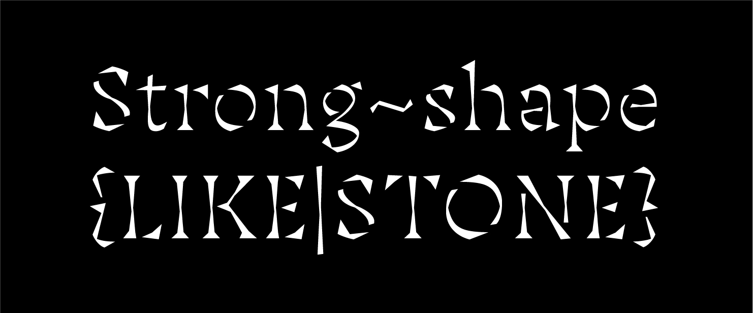
At the other extreme, the black style interprets the "Piano" drum. It is thick, deep, robust, and commands respect, much like the drum it represents. Its forms draw inspiration from expressionist posters of the early 20th century and Rudolf Koch's Neuland. Both references are equally weighty and robust.
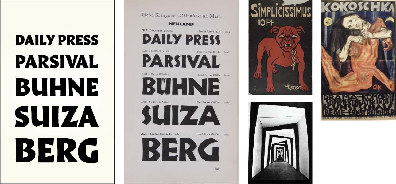
← 2023 — Mazumbá Black
↑ 1932 — Neuland Specimen, Rudolf Koch
→ 1896 — Bulldog Poster for the periodical Simplicissimus by Thomas Theodor Heine
1909 — Pietà (Poster for Murderer, Hope of Women) by Oskar Kokoschka
1920 — Das Cabinet des Dr. Caligari by Walter Reimann, Walter Röhrig & Hermann Warm
In the middle are the two styles that go from serif to sans-serif. The regular —Chico drum— chained to the tempo, is inspired by the faceted forms of Oldrich Menhart and, once again, Rudolf Koch (Book of Symbols), to create a style with a rustic appearance and dynamic movement, focusing on good legibility for immersive reading texts.
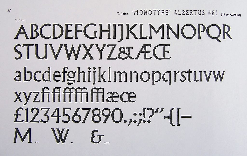
Lastly, the bold style —Repique drum— finds reference in Albertus, a typeface developed by Berthold Wolpe for Monotype. In this weight, Mazumbá establishes a midpoint between its Regular and Black styles. It stretches its form to move from one style to another, engaging with both and uniting them. Thus, the family takes shape, in close conceptual and morphological connection, avoiding obvious and/or traditional solutions.
Motion
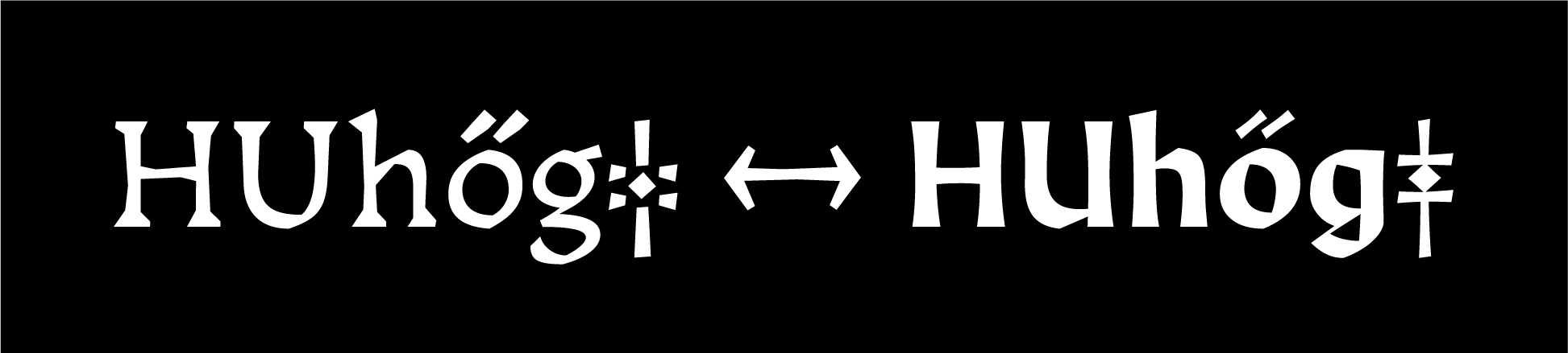
Another exploratory aspect of Mazumbá, and perhaps one of its most distinctive features, is its behavior in motion. Music is movement, Candombe is movement, Mazumbá is movement. A variable font on weight axis that contains two interpolations happening simultaneously. Depending on the style we find ourselves in, Mazumbá will display one or the other. This is how the "jumps" occur as you navigate through its styles to evoke the traditional dances of Candombe.
Future
In the short term, Mazumbá will incorporate italic versions of all its styles. Beyond that, much still remains to be explored in the pursuit of creating a typeface that, inspired by Afro-Uruguayan music, is capable of composing musical scores.
Conclusions
Mazumbá strives to be a bridge between cultural heritage and the visual expression of writing. The connection between forms and the sound of the drums transforms this project into a silent narrator of stories deeply rooted in our culture and identity.
The introduction of italic versions suggests an ongoing expansion, while the challenge of creating a typeface capable of composing musical scores promises a path of research and discovery. In this journey, Mazumbá seeks to transcend mere writing, aspiring to become a living artistic expression.
